Visualize tidycomm output
Source:R/categorical.R, R/correlation.R, R/describe.R, and 5 more
visualize.RdReturns ggplot2 visualization appropriate to respective tdcmm model
(see list below). Returns NULL (and a warning) if no visualization has
been implemented for the particular model.
# S3 method for tdcmm_ctgrcl
visualize(x, ..., .design = design_lmu())

# S3 method for tdcmm_crrltn
visualize(x, which = "jitter", ..., .design = design_lmu())

# S3 method for tdcmm_dscrb
visualize(x, ..., .design = design_lmu())

# S3 method for tdcmm_rgrssn
visualize(x, which = "jitter", ..., .design = design_lmu())

# S3 method for tdcmm_prcntl
visualize(x, ..., .design = design_lmu())

visualize(x, ..., .design = design_lmu())

# S3 method for tdcmm_ttst
visualize(x, ..., .design = design_lmu())

# S3 method for tdcmm_nnv
visualize(x, ..., .design = design_lmu())
Arguments
- x
tdcmmoutput- ...
other arguments
- .design
a list to style the visualization; by default and good practice use one of the ready-made design functions' returns (e.g.,
design_lmu(),design_grey()); you could, however, also provide your own list here which has to be a list with 9 keys:main_color_1, a vector of 12main_colors, a correspondingmain_contrast_1(the color of text to write on top of the main color) and a correspondingmain_contrasts, themain_size(for lines), acomparison_linetype,comparison_color, andcomparison_sizefor all lines that act as comparative lines, and a ggplot2theme- which
string to specify type of regression visualization. One of "jitter" (default), "alpha", "correlogram", "residualsfitted" (or "resfit"), "pp", "qq", "scalelocation" (or "scaloc"), "residualsleverage" (or "reslev"). See below for details.
Value
A ggplot2 object
Details
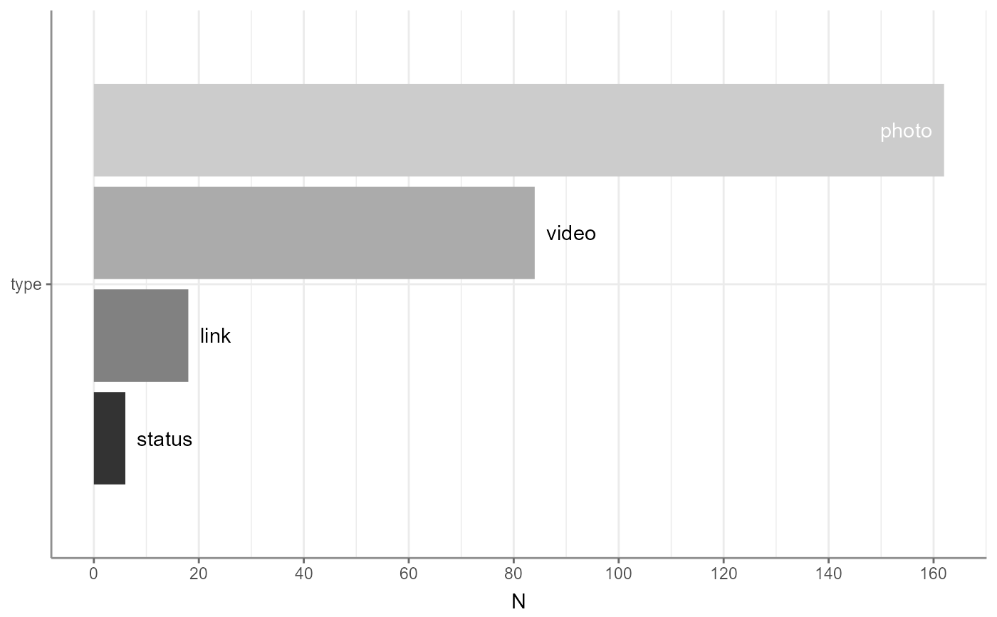
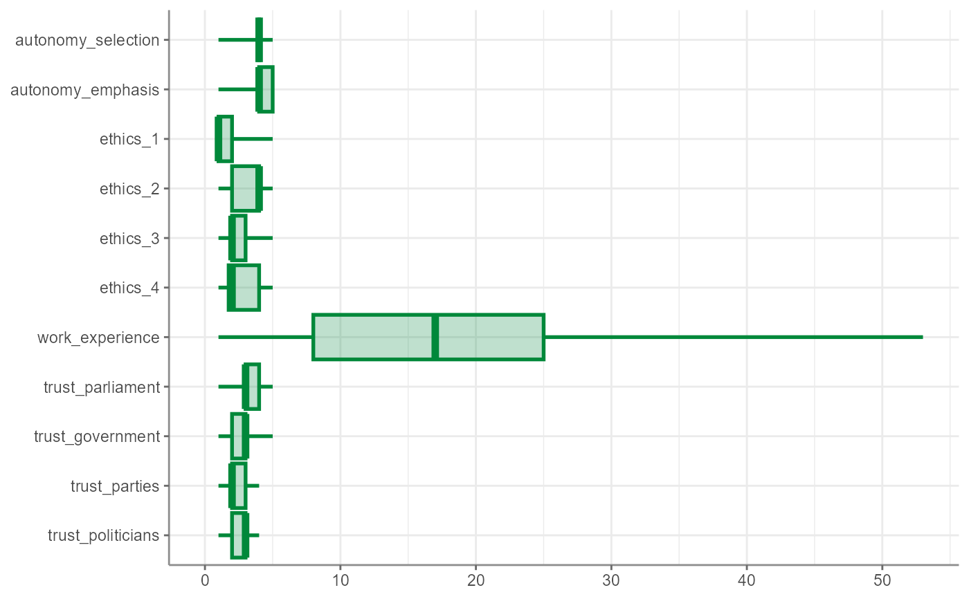
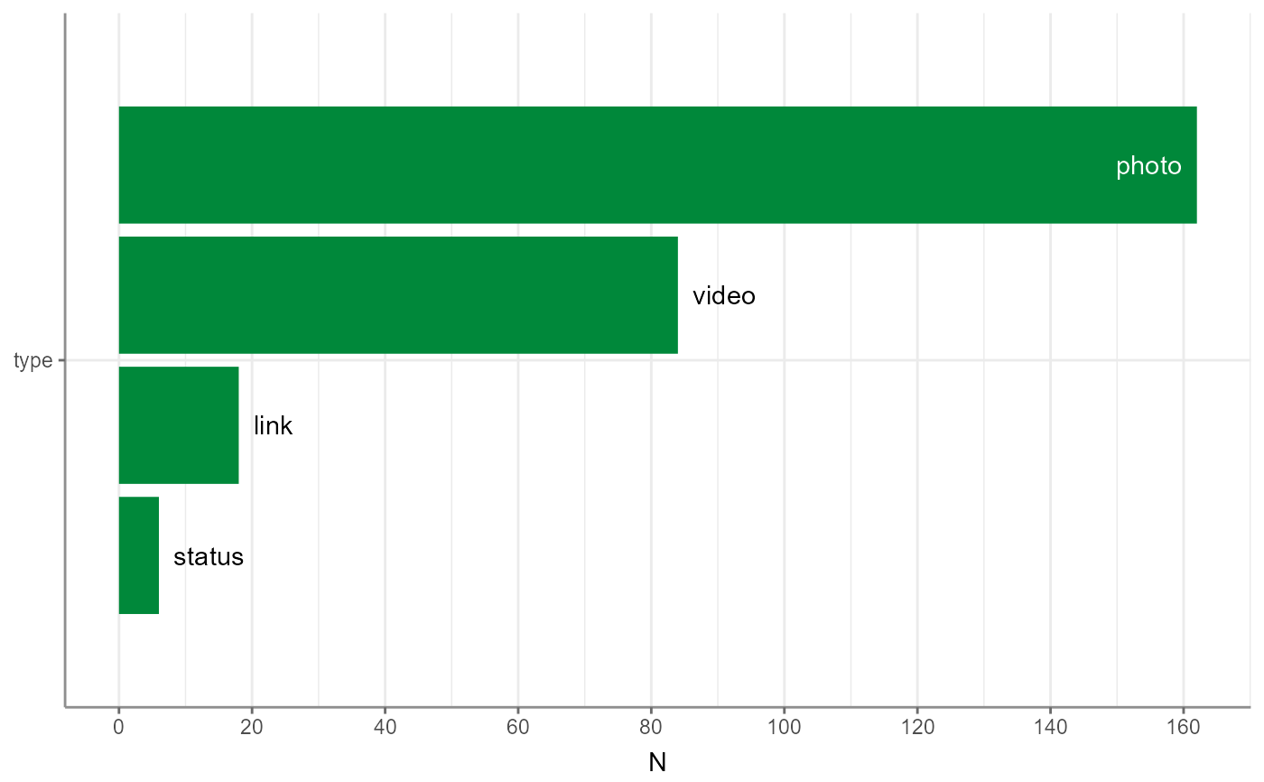
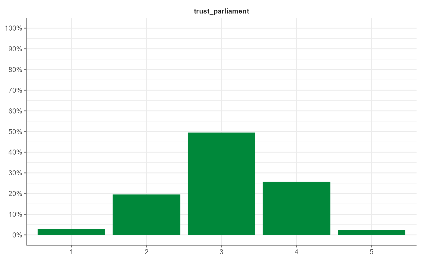
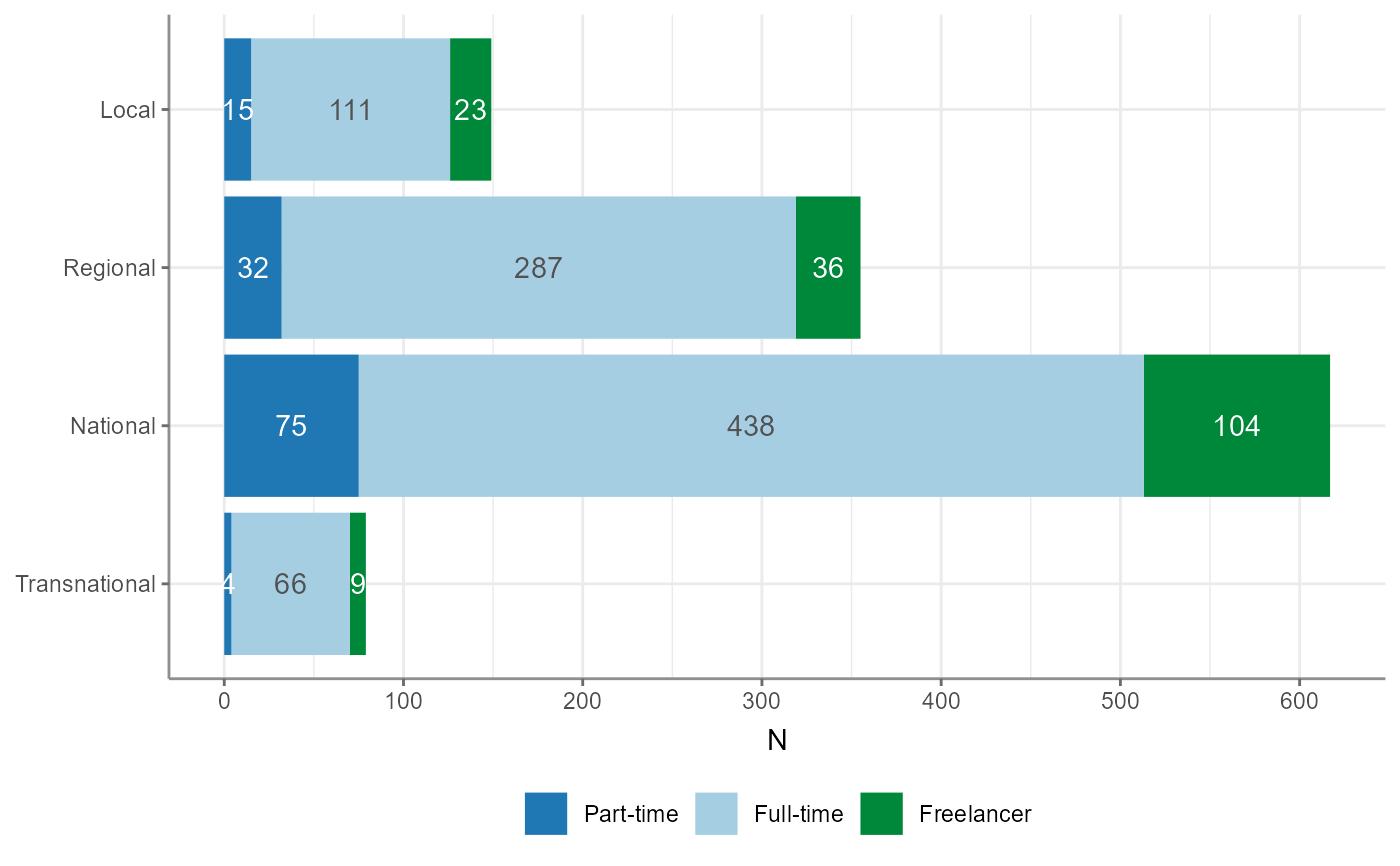
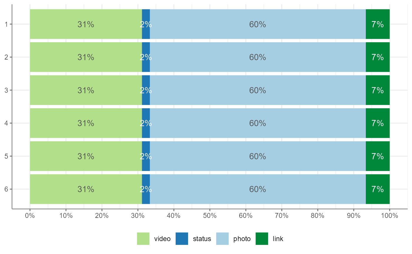
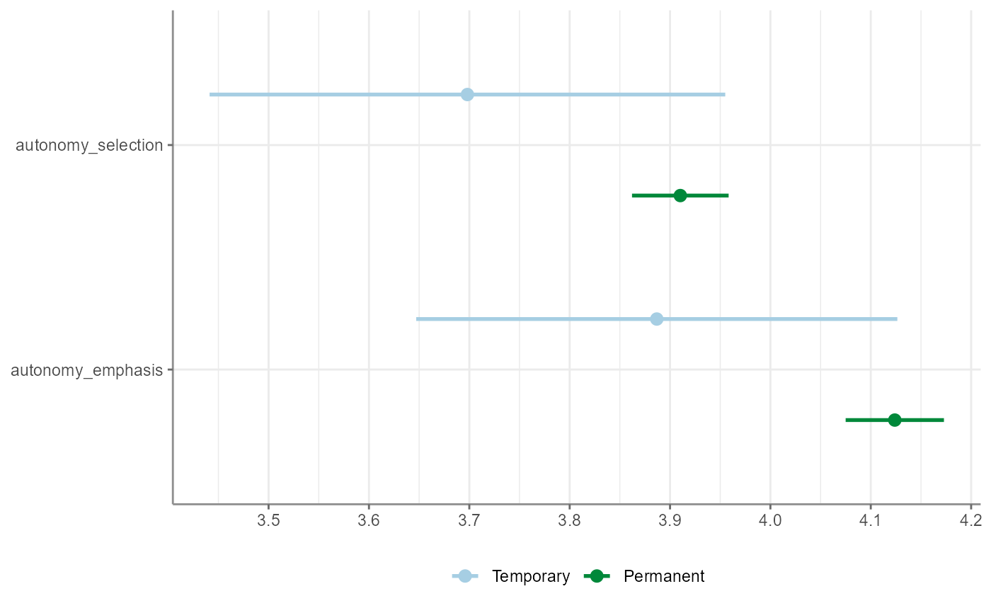
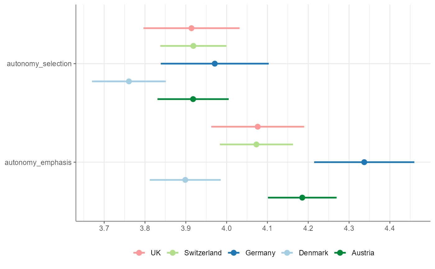
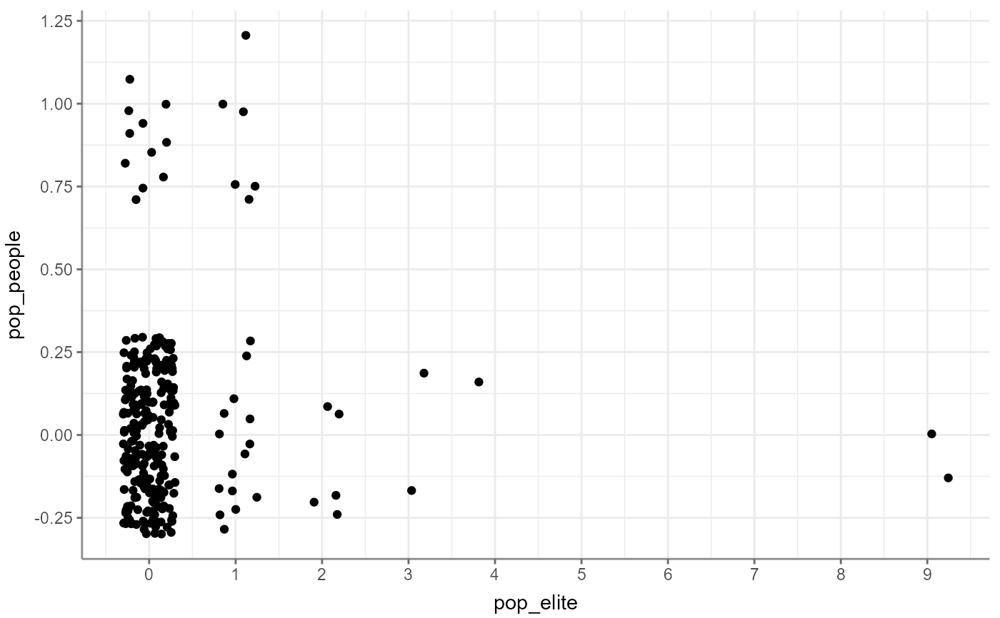
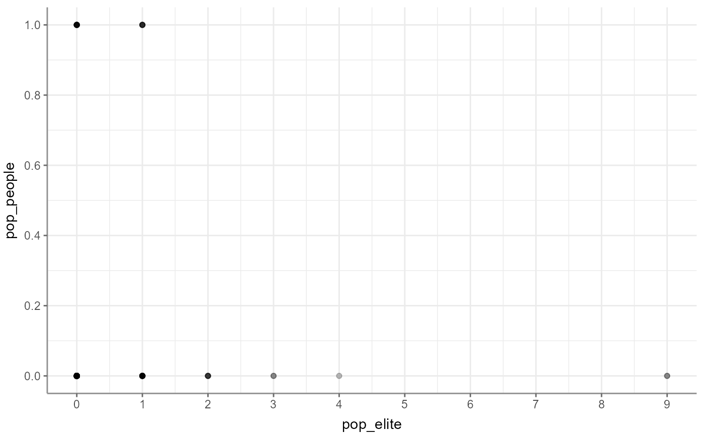
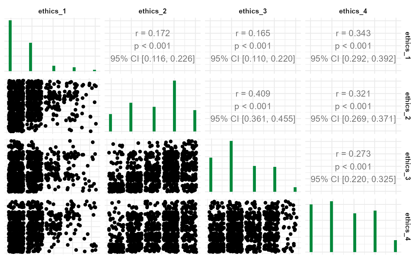
describe(): horizontal box plot depicting a box from Q25 to Q75, a thick line for Mdn, and two whiskers to Min/Max respectively; no additional argumentsdescribe_cat(): horizontal bar plot depicting number of occurrences; no additional argumentstab_frequencies(): either a histogram (if 1 variable is given) or multiple histograms wrapped, 5+ variables issue a warning about readability; no additional argumentstab_percentiles(): quantile plotcrosstab(): horizontal stacked bar plot, either absolute or relative (depending on thepercentagesargument incrosstab())t_test(): plot with points and appended 95% confidence intervals; no additional argumentsunianova(): plot with points and appended 95% confidence intervals; no additional argumentscorrelate(): plot as scatter; for more than 2 variables, a correlogram is plotted (just like forto_correlation_matrix()); use thewhichparameter to select how points are visualized:"jitter" adds a bit of random noise to each point to better reflect categorical values
"alpha" depicts points slightly transparent so that multiple points in the same position are more easily visible
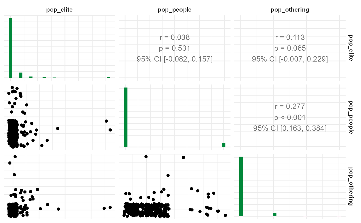
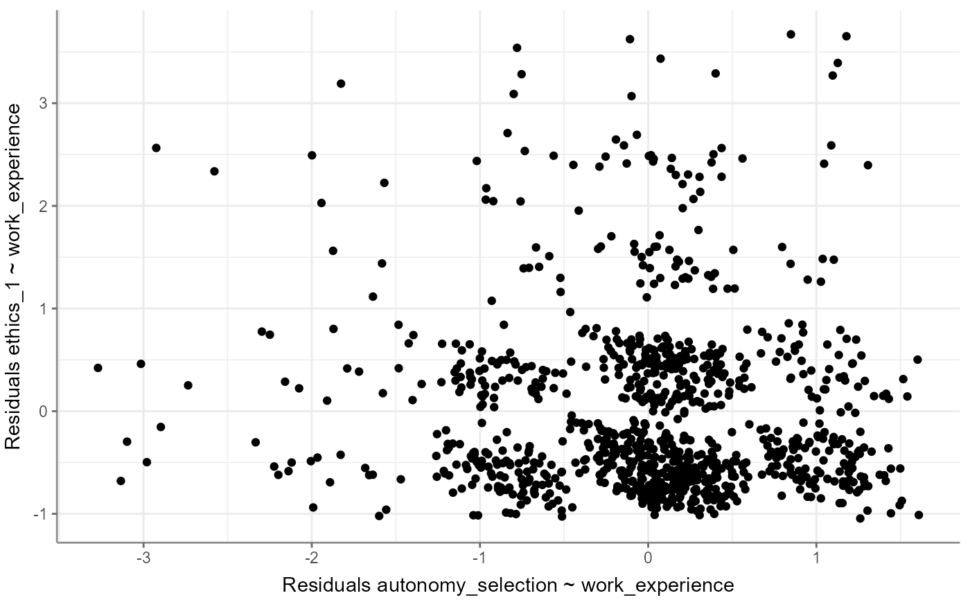
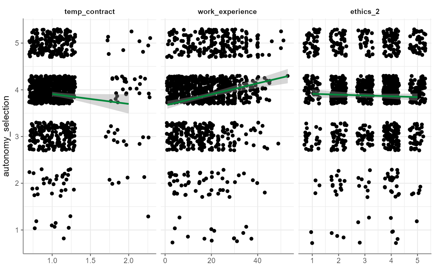
correlate(): for partial correlation, a scatter plot with some jitter is plotted using the residuals between the control variable and (a) the dependent as well as (b) the independent variable; no additional argumentsto_correlation_matrix(): plot as correlogram building onGGally::ggpairs()with jittered scatter plots in lower half, histograms as diagonals, and correlation coefficients with 95% confidence intervals in upper halfregress(): plot regression results as scatter (without jitter) and an additional depicted model line with including its 95% confidence intervals; alternatively, visual check inspection helpers can be plotted through thewhichparameter which can be set to yield one of the following:"jitter" (default): plots a scatter plot with jitter per independent variable and adds a linear regression line with 95% confidence intervals to it; keep in mind that if you have, say, three independent variables, this visualization shows you three plots with one linear regression for each, so that the three models (i.e., the three colored lines) reflect only the particular combination of one independent and the dependent variable
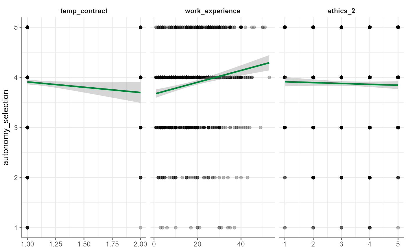
"alpha" (default): almost like
jitterbut instead of jitter it plots scatter plots with some transparency so that multiple data points in the same position appear as darker"correlogram": like
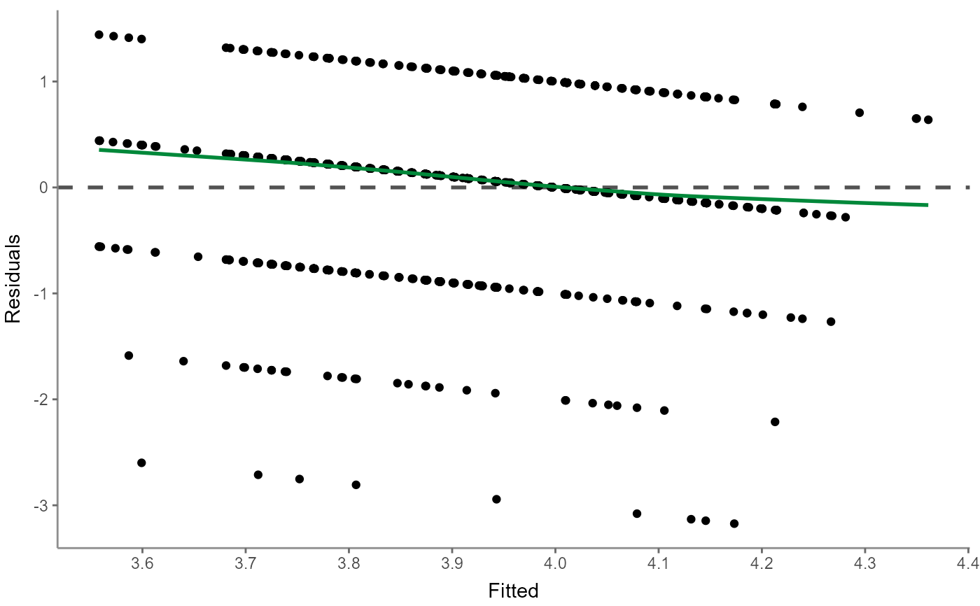
to_correlation_matrix(), a correlogram between independent variables are produced to help determine independent errors and multicollinearity"residualsfitted" or "resfit": a residuals-versus-fitted plot is useful to determine distributions; for a normal distribution the colored line should ideally fit on the dashed line
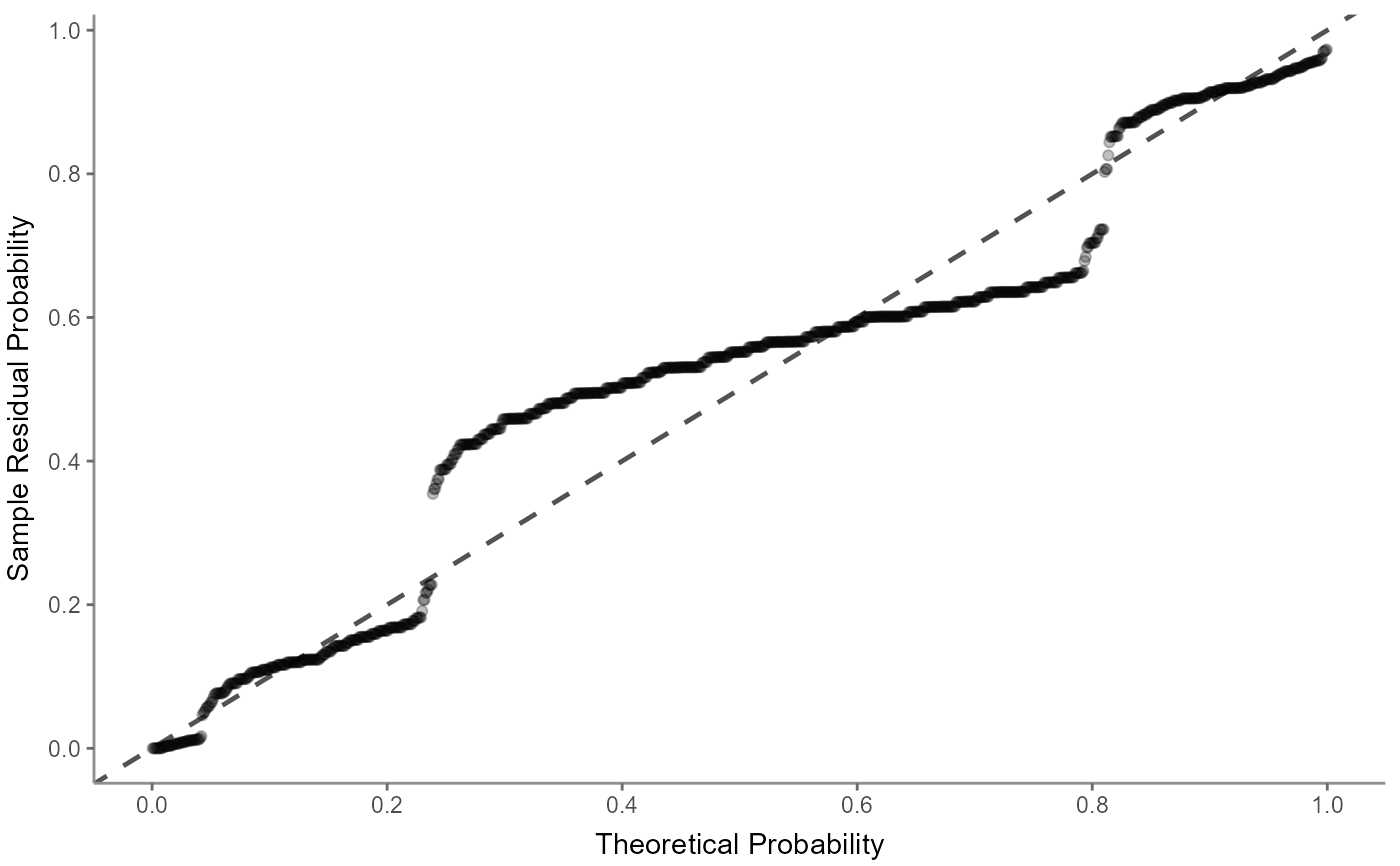
"pp": a (normal) probability-probability plot helps checking for multicollinearity whereby the data (here mostly the center data from within the IQR) should ideally align with the dashed line
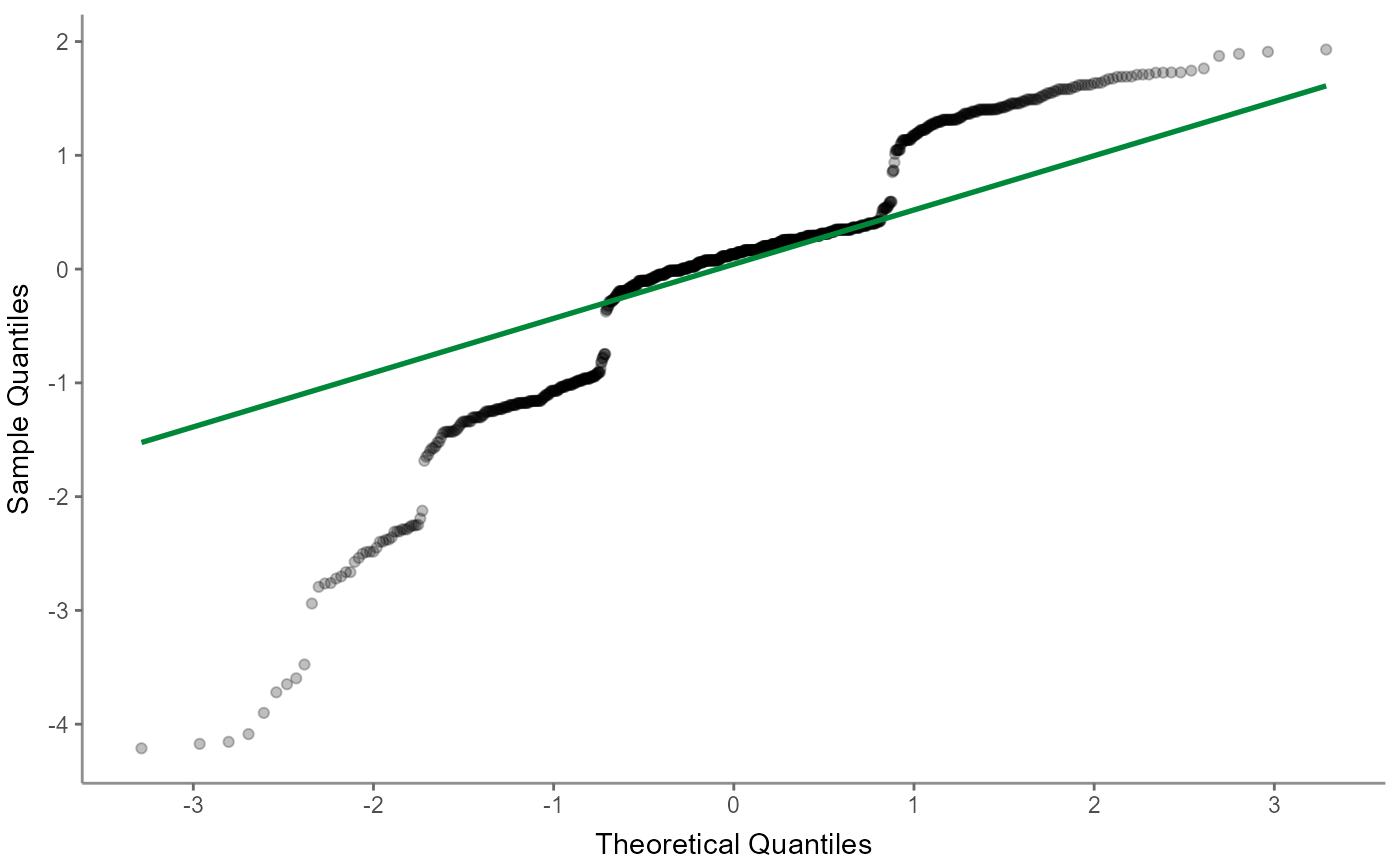
"qq": a (normal) quantile-quantile plot helps checking for multicollinearity but focuses more on outliers; the data should align with the dashed line
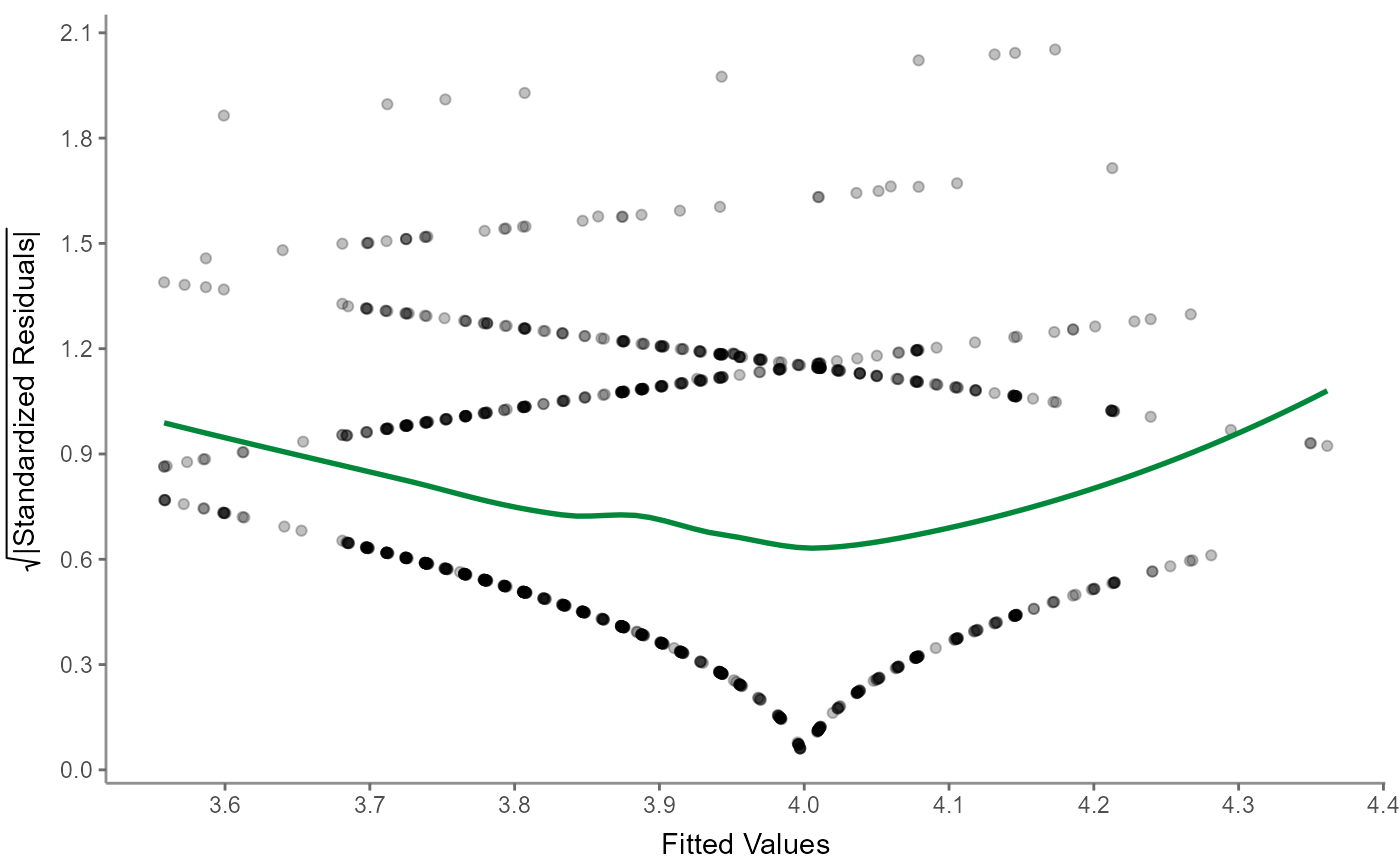
"scalelocation" or "scaloc": a scale-location (sometimes also called a spread-location) plot checks whether residuals are spread equally to help check for homoscedasticity; ideally, the colored line is horizontal and the data spreads more or less randomly
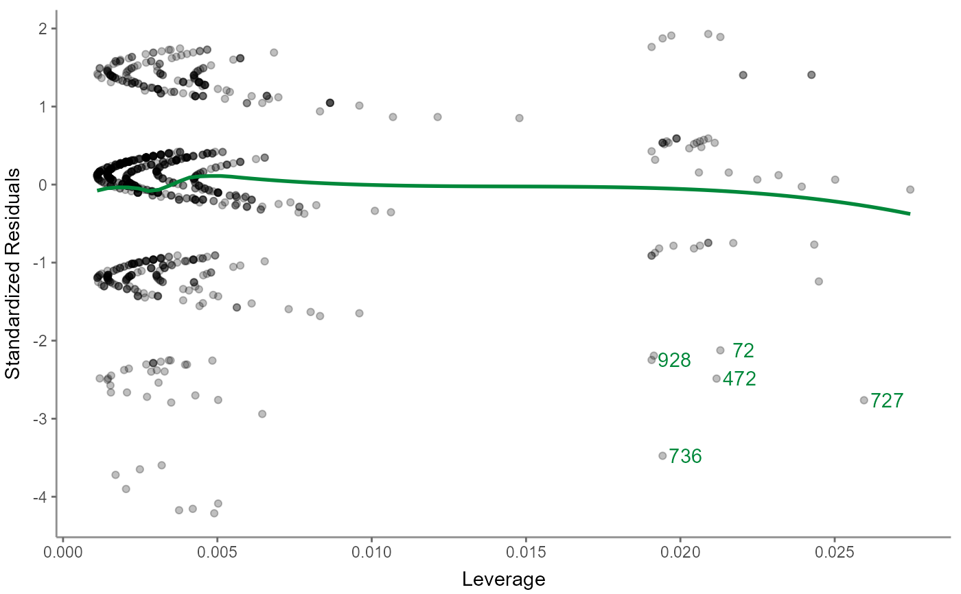
"residualsleverage" or "reslev": a residuals-versus-leverage plot allows to check for influential outliers affecting the final model more than the rest of the data; ideally, no data is far off compared to the bulk of the the data and thus shows high Cook's distance to the rest; the colored line helps to identify the bulk of the data and the five most-distant outliers are labelled with their case number (i.e., the row number in the dataset); note that 5 is arbitrary here, meaning that they might not be too far off or there might be more than 5 noteworthy outliers in this model; interpret with care
Note that the returned ggplot2 object can be modified easily by appending or overwriting individual geom's or scale's. See the examples below and the documentation of ggplot2.
Examples
WoJ %>%
describe() %>%
visualize()
 fbposts %>%
describe_cat() %>%
visualize()
 WoJ %>%
tab_frequencies(trust_parliament) %>%
visualize()
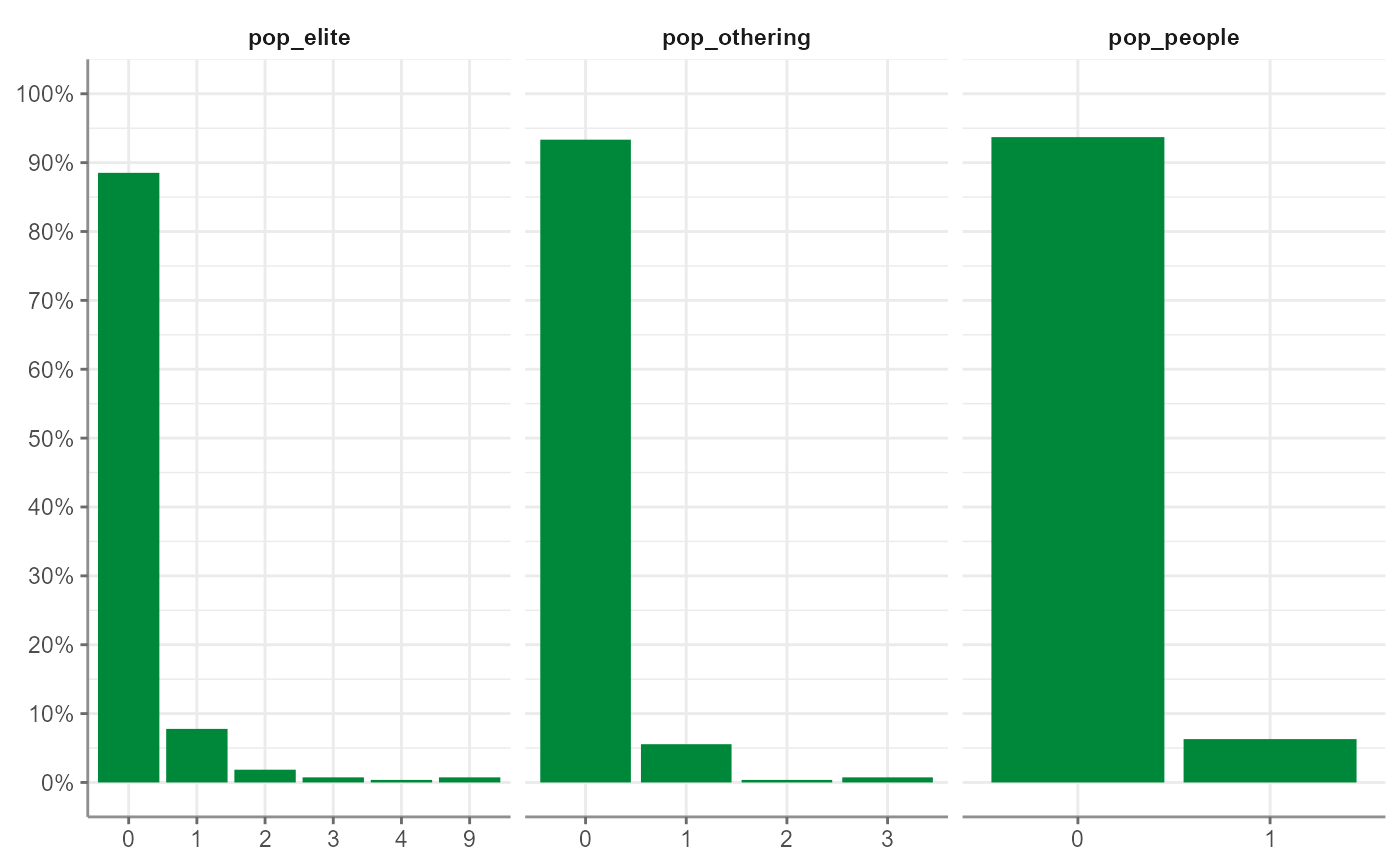
 fbposts %>%
tab_frequencies(pop_elite, pop_people, pop_othering) %>%
visualize()
 WoJ %>%
crosstab(reach, employment) %>%
visualize()
 fbposts %>%
crosstab(coder_id, type, percentages = TRUE) %>%
visualize()
 WoJ %>%
t_test(temp_contract, autonomy_selection, autonomy_emphasis) %>%
visualize()
 WoJ %>%
unianova(country, autonomy_selection, autonomy_emphasis) %>%
visualize()
#> The significant result from Levene's test suggests unequal variances among the groups, violating standard ANOVA assumptions. This necessitates the use of Welch's ANOVA, which is robust against heteroscedasticity.
 fbposts %>%
correlate(pop_elite, pop_people) %>%
visualize()
 fbposts %>%
correlate(pop_elite, pop_people, with = pop_othering) %>%
visualize()
 fbposts %>%
correlate(pop_elite, pop_people) %>%
visualize("alpha")
 WoJ %>%
correlate(autonomy_selection, ethics_1, partial = work_experience) %>%
visualize()
 WoJ %>%
correlate(ethics_1, ethics_2, ethics_3, ethics_4) %>%
to_correlation_matrix() %>%
visualize()
 r <- WoJ %>% regress(autonomy_selection, temp_contract, work_experience, ethics_2)
r %>% visualize() # same as r %>% visualize("jitter")
 r %>% visualize("alpha")
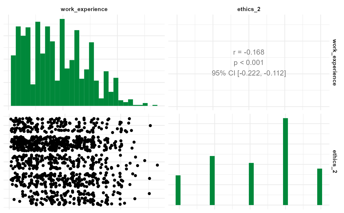
 r %>% visualize("correlogram")
#> Warning: only numeric variables will be included in this plot, all factor variables (temp_contract) have been dropped for this visualization
 r %>% visualize("resfit")
 r %>% visualize("pp")
 r %>% visualize("qq")
 r %>% visualize("scaloc")
 r %>% visualize("reslev")
 # To overwrite a certain scale or geom, just append as you would with ggplot2
fbposts %>%
describe_cat() %>%
visualize() +
ggplot2::scale_fill_grey()
#> Scale for fill is already present.
#> Adding another scale for fill, which will replace the existing scale.
